Categories
Uncategorized

Mini Projects: Coffee Shop Dashboard

In this project the aim is to build an interactive dashboard to observe and analyze coffee shop sale prices.

  1. Preparing the Data for Analysis

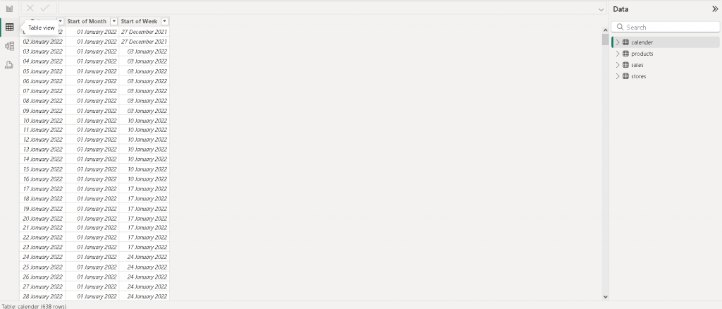
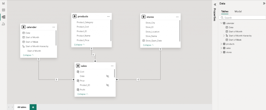
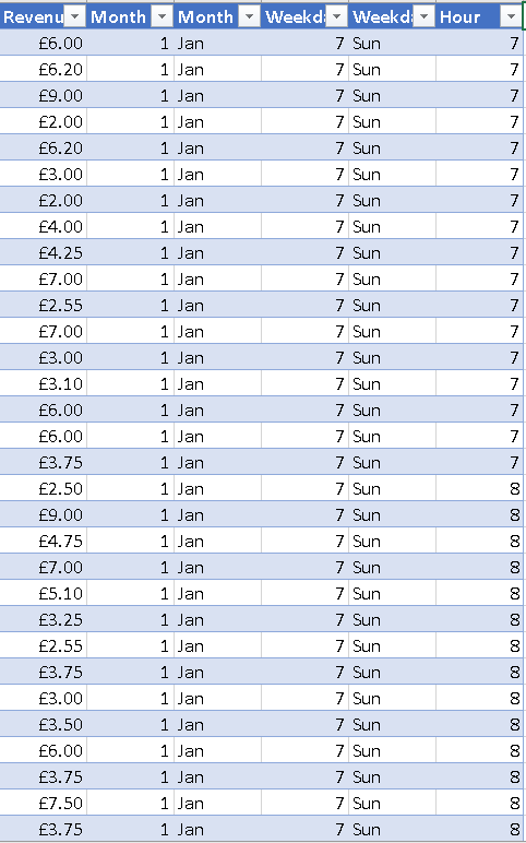
The coffee shop dataset is observed by checking transactions that were recorded over a period of time. Also the number of products and Categories sold was noted. Afterwards a new column was added to calculate Revenue. Additionally the Month, Day of Week and Hours were added.

2. Explore the Data using Pivot Tables

The next task was to create a pivot table that allow the data to be sliced for simplicity. With data organized in a table it is ready to be used in the dashboard.

3. Create the Dashboard

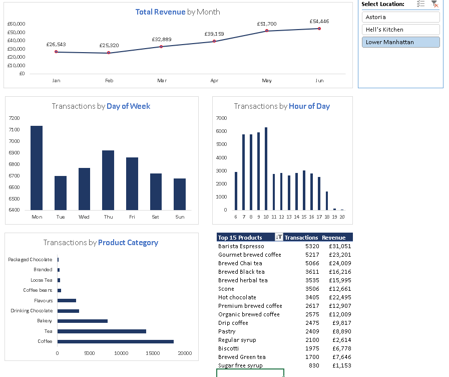
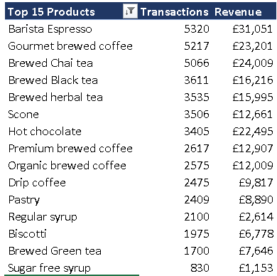
The final step was to create a dashboard to visualize the data. First step was to create Pivot charts to show the Total Revenue by Month, Transactions by Day of the Week, Transactions by Hour of day and Transactions by Product Category. The charts are assembled into a rough dashboard format and contains a table showing the top 15 products types.

A slicer was added for store location location which allows the data and visualization to be updated for each location. From the end result patterns and trends can be observed.

Categories
Power BI

Mini Projects: Maven Toy Store Data

Recently I starting to do some projects using some datasets on Maven Analytics. This will help add to portfolio and practice some of the techniques that were picked up from the Maven analytics course. For this project Power BI was used.

1. Clean, Connect and Profile the Data

Firstly the data was cleaned up excel using data formatting on the dates in the calendar CSV file. Once the CSV are cleaned, it taken into Power ready to be connected.

Once the data is connected , the files are checked for errors and blanks. Afterwards two columns containing the start of the month & week is added.

2. Create a Relational Model

The next step is at add a relational model by connecting the sales , products and store and calendar tables together. After that a data hierarchy is added which will be used later on.

3. Calculated Measure & Fields

Some new measures and fields such total orders, sum of revenue and sum of profit are added to field tables. This will be used for final analysis in the interactive report later on.

4. Building an Interactive Report

The data is visualized using a dashboard in power bi. The board shows the orders, revenue and profit over time and by product category.

Categories
Uncategorized

Early Childhood Infographic for child international

During my time working at the Happy International charity I been helping them to move into Predictive Technology and organize their database for better Donor Insights.

This also involved designing a info graph on children childhood in brazil in order to illustrate the challenges some children need to overcome and reach their potential. Using the infograph will help engage with donors as this will keep them in the loop.

Charity website: https://www.happychild.org/post/early-childhood-in-brazil

Categories
Data Science & Python

Maven Taxi Challenge

Recently I am working on a challenge. This challenge is chance to test my analytic skill and what I have learnt from the Udemy course on Machine Learning.

To start off with I performed a data analysis on the Taxi dataset using Jupiter note book. The data is cleaned up using python ‘s data frame library (The library can read CSV files and put into in rows and columns and manipulate them). In addition, I used python Mat plot library to represent the data in a scatter graph plot.

Below is what i have worked on so far.

Categories
Graphics Design

Flyer Design

Recently I was asked to design a flyer to company a news letter for an organisation that is raising funds for the Sierra Leone Community. The first step was to get an understanding of the newsletter which is when used to create the first concept. Below is the sketch.

Figure 1: Early concept of the Flyer

I then used gimp (similar to photoshop) software to design the flyer. This involved using a combination of layers and transform and rotation to combine all the images and text together. Below is the end result.

Figure 2: Final Design of the Flyer
Categories
Mobile Application Projects Uncategorized

Xcode: First App Test: Bullseye


I recently started a self taught course in IOS Development in order to get to grips with the fundamental structure of swift language, Xcode ’s tools and make the final translation of getting my app on devices and the Apple store.

After getting an introduction to Xcode and Swift I have managed to produce a simple slider app called Bulleye.
The next step is to knock down the core area of swift code itself.


The end result of the app is shown in figures 1-3 below.

IMG_4441 2

Figure 1: Bullseye App instructions

IMG_4439

Figure 2: Bullseye Game Interface

IMG_4440

Figure 3: Bullseye: Points based on the distance to the target

Categories
Game Projects

Metoria Games Animation: Inventory

RPG Character Inventory

Screen Shot 2017-11-20 at 19.11.33

Figure 1: Completed Inventory

Screen Shot 2017-11-20 at 19.11.03

Figure 2: Inventory showing the list of items picked up

AnimationRPGTEST copy3

Figure 3: Female Character picking up the item

Categories
Game Projects

Metoria Games Animation: RPG Character Animation

RPG Character Animation

Screen Shot 2017-07-12 at 18.42.56

Figure 1: Female Character in T – pose in Unity 3D

Screen Shot 2017-07-12 at 18.43.30

Figure 2: Female Character in idle pose

Categories
3D Design

3D Fashion Experiment: Woman ‘s dress

3D Fashion Experiment: Woman ‘s dress

Screen Shot 2017-07-25 at 18.45.42

Figure 1: Marvelous Designer 6: Using shapes and stitching them together to fit over the body

Screen Shot 2017-07-25 at 18.46.43

Figure 2: Marvelous Designer 6: Using the physics stimulation to make the shape behave as cloth.

Screen Shot 2017-07-25 at 21.06.10

Figure 3: Marvelous Designer 6: Using contraints to shape the cloth as a dress. 

Screen Shot 2017-07-25 at 21.06.20
Categories
Mobile Application Projects

App Research: Calculator

App Research: Calculator


This week I created a simple calculator in Xcode. The calculator’s interface was designed using Xcode ’s tools. The interface contains buttons and labels as shown below in figure 1.

Screen Shot 2017-07-25 at 12.50.47

Figure 1: Calculator’ s Interface

After the interface was designed, the operations such as addition , division and multiplication were executed using Swiftcode. In figure 2 it shows the code that was written to execute the operations. 


Screen Shot 2017-07-25 at 12.50.33
Figure 2: Script written to execute the calculator ’s operations

The end result is shown in figure 3 below.

CalcuatorApp2

Figure 3: Calculator’ s End Result